Re-validating our SP Matchup Scores
Jul 18 2025
Our Starting Pitcher Matchup Scores are one of the most prominent tools on the site. We use them as the jumping-off point for our Daily Matchups articles, as the primary input to our The Week Ahead planning tool, and generally encourage you, the reader, to lean on them heavily in your decision-making.
All of which makes it important for us to periodically show receipts and demonstrate that this tool effectively rates a pitcher's individual starts. We last did that in 2021, so clearly we're due for a reevaluation. The All-Star Break makes for a nice time to crunch these numbers, so we pulled the Matchup Scores for the entire first half to see how the tool is working.
Very short answer: we're doing quite well. But let's take a closer look.
In the hunt? BaseballHQ.com can help you snag the title. Unlock all of our insights like these for the rest of the season: Subscribe to BaseballHQ.com.
Refresher on Matchup Score methodology
The header on our Matchup Scores page explains our methodology pretty succinctly:
We calculate a pitcher's individual Matchup Score for a single start by first calculating an individual score representing his potential performance for each rotisserie category, and then rolling those into an overall rating for the day's start.
This rating assesses each starter's outlook on a given day, taking into account the pitcher’s inherent ability, recent performance, strength of defense, ballpark, and the opposition’s offense's recent history.
For a deep dive into the guts of the calculation, you can review the original 2017 research piece from Arik Florimonte, as well as the rationale for the adjustment we made in 2020.
Previous validations of the Matchup Scores formula
We have done two similar validations of these scores, most recently in 2021, and prior to that, after their first half-season of availability in 2018. Both of those exercises were done mid-season, as is today's… which means there is still room for a full-season study that might address the possibility that the scores are more or less accurate at different points in the season. We'll put that on our to-do list.
Today's approach deploys the same tools as in those previous validations. We'll compare the pre-game Matchup Scores to the post-game PQS logs, as well as to DraftKings' point total for each start.
Why PQS? Pure Quality Starts are our long-time shorthand metric for evaluating the quality of each pitcher's start based on the skills displayed, rather than the outcome in terms of earned runs. It just makes too much sense to validate our pre-start metric against our post-start metric.
The downside of using PQS for this purpose is its simplicity: the 0-5 PQS scoring is broad-brushed by design, but that is somewhat limited for our purposes today. DraftKings' SP scoring system then makes for a good complementary validation tool, as it gives us a lot more granularity in scoring each start. Here is the DraftKings scoring system:
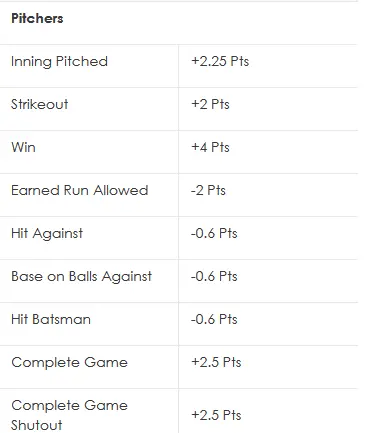
Note that we'll be ignoring the CG and SHO components, as those events aren't identified cleanly in our PQS logs, and they're sufficiently rare in modern MLB anyway.
Besides the granularity, the other important aspect of the DraftKings (DK) scoring system is that, despite generating a single point total as its output, the underlying components are measuring the same things (Win, ERA, WHIP, Strikeouts) that we're trying to predict in advance with the Matchup Scores.
For anyone interested in further exploring their own validations, the pre-game Matchup Scores are included in the CSV downloads on our PQS logs page.
Distribution of Matchup Scores
Before we even compare Matchup Scores with results, let's start by just looking at the straight distribution of Matchup Scores. If the scores are clustered in a narrow range or skewed to the high or low side, that cluster can affect the tool's utility right out of the gate.
There were 2896 game starts in the first half of 2025. To study them, we chunked them into ratings buckets sized at 0.5 ratings points. Here is the distribution.
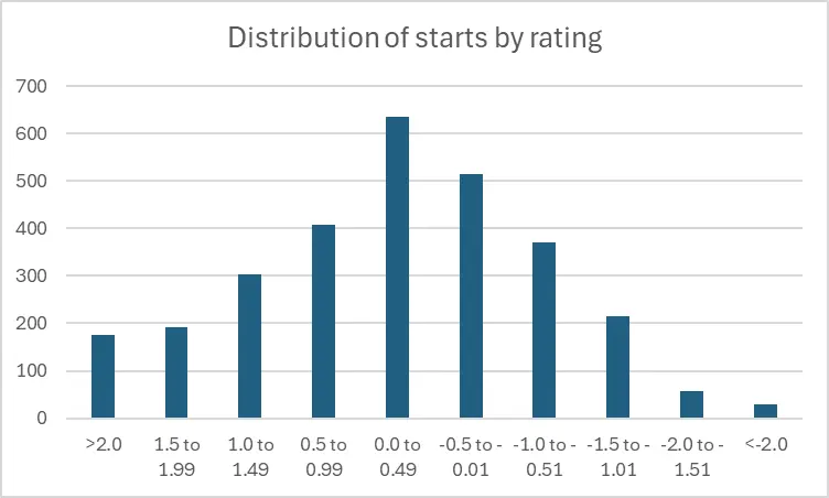
| Rating bucket | # starts | % of starts |
| >2.0 | 175 | 6% |
| 1.5 to 1.99 | 192 | 7% |
| 1.0 to 1.49 | 303 | 10% |
| 0.5 to 0.99 | 407 | 14% |
| 0.0 to 0.49 | 635 | 22% |
| -0.5 to -0.01 | 514 | 18% |
| -1.0 to -0.51 | 371 | 13% |
| -1.5 to -1.01 | 215 | 7% |
| -2.0 to -1.51 | 57 | 2% |
| <-2.0 | 29 | 1% |
| All 2025 | 2896 | 100% |
This is a pretty nice approximation of a bell curve distribution. But it's not perfect, in a couple of notable ways:
- The outer edges of the curve lean more heavily to the left. That is, we get a lot more starts rated +1.5 or better than we get starts rated -1.5 or worse. That probably isn't surprising, as there is likely a survivor's bias effect going on: pitchers who rate that poorly (and pitch that poorly) don't tend to stay in rotations for long.
The inner part of the curve also leans to the left, but less dramatically than at the outer edges. Here's one way to summarize that using larger ratings buckets.
Start distribution % rated positive % rated negative Starts rated outside of -1.0 to +1.0 range 69% 31% Starts rated inside of -1.0 to +1.0 range 54% 46% All starts 59% 41% - One more way to summarize the “lean” of the data: of the 2896 starts to date this year, the median or midpoint rating is +0.12. That's not exactly a 0.0 midpoint, but it's close enough that we can still get away with broadly thinking “positive ratings good, negative ratings bad”. And since we color-code starts greater than +0.5 as green and less than -0.5 as red on our charts, that logic very much holds up.
Validating ratings vs. outcomes: Part 1, PQS
Enough about the distribution of the scores, let's get into the comparison of pre-game scores to actual results.
As above, we'll bucket the Matchup Scores into 0.5-sized ranges. First, PQS scores:
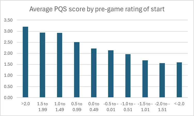
| Rating bucket | Avg PQS score |
| >2.0 | 3.20 |
| 1.5 to 1.99 | 2.93 |
| 1.0 to 1.49 | 2.93 |
| 0.5 to 0.99 | 2.50 |
| 0.0 to 0.49 | 2.21 |
| -0.5 to -0.01 | 2.14 |
| -1.0 to -0.51 | 1.97 |
| -1.5 to -1.01 | 1.68 |
| -2.0 to -1.51 | 1.56 |
| <-2.0 | 1.59 |
| All 2025 | 2.33 |
That's a nice decaying curve in the graphical view, with just a little bit of a weird tail at the right end. You can see in the tabular data that it's not really a significant difference between the last two ranges, and we know from the distribution table further up that we're pretty light on starts that fall into those two ratings buckets. Those two bottom ranges total just 3% of all starts, so it's not surprising to find some sample-size noise in there.
Validating ratings vs. outcomes: Part 2, DraftKings
Let's see if the additional granularity of the DraftKings scoring system yields a different distribution curve:
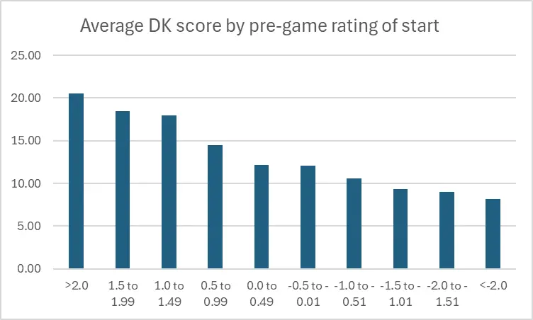
| Rating bucket | Avg DraftKings score |
| >2.0 | 20.54 |
| 1.5 to 1.99 | 18.46 |
| 1.0 to 1.49 | 17.98 |
| 0.5 to 0.99 | 14.43 |
| 0.0 to 0.49 | 12.14 |
| -0.5 to -0.01 | 12.04 |
| -1.0 to -0.51 | 10.55 |
| -1.5 to -1.01 | 9.31 |
| -2.0 to -1.51 | 8.97 |
| <-2.0 | 8.14 |
| All 2025 | 13.46 |
The added granularity (we won't call it precision, exactly) does create a bunch of additional color here:
- Starts>1.0 are our highest-value ratings in terms of DK points generated.
- The middle of the table is very murky: the overall decay curve holds up, but barely: there's virtually no difference between a slightly positive (0.0 to 0.49) and slightly negative (-0.5 to -0.01) start. Put another way, there's a reason we have long referred to this as the “Judgment Call” zone.
- Even though (as discussed above) we don't see a ton of starts rated worse than -1.0, the DK scores indicate that you don't want to go anywhere near a start that falls in that range.
Macro-validation vs. micro-validation
The above results shouldn't be surprising, as they are very consistent with our prior back-tests. The tool's methodology hasn't changed, and we're using the same approach to validation. The MLB environment itself changes all the time, but with almost a decade of usage and multiple tests under our belt, it's pretty clear the tool holds up to the shifting tides of the MLB game it is trying to measure.
There is one particular criticism of this tool that we've never tested until now. It's the notion that “the tool rates good pitchers high and bad pitchers low”. In other words, the tool is spitting out numbers that are simply reflective of the quality of the pitcher, and not necessarily the specific one-start matchup. As the argument goes, the types of tests we ran above can simply be explained by the idea that good pitchers have good projections and good recent results (both of which are inputs to the Matchup Scores), and good pitchers tend to post better PQS and DK scores in the specific start being rated, so the Matchup Score is an echo chamber rather than a new, standalone data element.
Individual SP variability in scores
That notion is a tough thing to prove or disprove with data, but we may have found a method of analysis to see if there's any validity to that particular criticism.
144 pitchers made at least 10 starts in the first half. For that population, we pulled each pitcher's highest- and lowest-rated start from their game log, as well as their DraftKings scores from those starts. This gives us a data set where we can compare, for the same population of pitchers, how they fared when they had a high rating vs. a low rating (for their personal ratings range).
First, we can see how much the high and low scores vary for these pitchers.
| Pitchers | Low MU Rating - avg | High MU Rating - avg |
| average of 144 SPs | -0.75 | 0.89 |
That is a pretty sizable range of Matchup Scores there. We referred to the “Judgment Call” range above, those ratings that fall in the -0.5 to +0.5 ratings range, where there is very little difference in outcome. But for these 144 pitchers, their best and worst pre-game ratings get well outside of our “Judgment Call” zone, meaning that we consider these ratings changes actionable.
Which raises the question: when Matchup Scores show that kind of range, should you be trusting the rating, or the pitcher? This is what Brent Hershey has been testing with his “Gut Check” (Part 1 | Part 2) exercise in lineup-setting using these scores.
So there's a sizable difference between this population's lowest- and highest-rated starts. Let's check how their DraftKings points fare in those low and high starts:
| Pitchers | avg DK points from lowest MU rating | avg DK points from highest MU rating |
| average of 144 SPs | 10.28 | 14.33 |
That doesn't look like a giant spread at first glance. But, if you take those two numbers and “look them up” in the table that charts DK points by Matchup Score buckets, you see that the ‘Low’ 10.28 score would plot right into the correct range for the -0.75 rating (the -1.00 to -0.51 bucket). The ‘High’ 14.33 DK point total would fall just short of the 0.50 to 0.99 bucket that we would have plotted the 0.89 average Matchup Score into for this group.
The conclusion to be drawn here is that, when trying to decide whether or not to activate a pitcher for a single start, and that start is being scored on the very high or low end of their normal range of Matchup Scores and you aren't sure whether to trust “the pitcher” or “the rating”, the answer from this data is:
- For a low-rated start, trust the rating.
- For a high-rated start, trust the rating but discount it just a little bit.
Caveats and qualifiers
Despite these results, I'm not messaging Brent and telling him to shut down his “Gut Check” exercise. What we can say with confidence in evaluating these Matchup Scores is that they work well over large sample sizes. It scored nearly 2900 starts over the first half. But in your leagues, you're choosing to activate (typically) nine pitchers (not all of whom are starters) on a (typically) weekly basis, so that's on the order of a hundred specific decisions throughout a half-season, and where a fraction of those would be less-than-automatic. As the sample size shrinks, variance in outcomes spikes.
Even in our high/low score comparison, because we're taking averages of outcomes for 100+ pitchers, there's plenty of individual variance washed out in the averaging. Grabbing the alphabetically-first pitcher with 10+ GS in the PQS logs, Andrew Abbott, demonstrates this: Abbott scored his second-highest DK points of the season (24.85) in his lowest-rated start, and a mediocre 11.85 DK points in his highest-rated start.
Put all of that together, and our best guidance for using this tool is as follows: We have hopefully demonstrated conclusively here that the tool works well for rating SP matchups in the aggregate. But your fantasy team isn't an aggregation, so don't just follow these scores blindly. There is plenty of room (especially within that -0.5 to +0.5 “Judgment Call" range) to overrule the tool and apply your own judgment. And when a rating looks particularly high or low for your pitcher's normal range, once again, you don't have to follow it blindly, but you should take it seriously… especially for a low rating.
More From GM's Office

Each baseball season brings tweaks and changes, to both players (we're looking at you, Randy Vásquez!) and our site toolbox and staff. Here are some BaseballHQ updates.
Apr 24 2026 8:30am
Apr 24 2026 8:30am

Our favorite late-March tradition returns: Brent and Ray spent Opening Day watching every game and riffing their observations...
Mar 27 2026 8:51am
Mar 27 2026 8:51am

Our annual exercise of polling the BaseballHQ staff to get their answers to burning questions.
Mar 21 2026 3:03am
Mar 21 2026 3:03am

UPDATE: Staffer Alain de Leonardis was recognized for his NL East PT Tomorrow column as the Best Baseball Series of 2025 by the Fantasy Sports Writers Association!
FREE
Feb 27 2026 5:02pm
FREE
Feb 27 2026 5:02pm

March Madness isn't a basketball term around here... today we have some projections data updates and other site tips to make sure you're getting the most out of your subscription in these critical days of draft season.
Feb 27 2026 3:11am
Feb 27 2026 3:11am